Introduction
“Working together to build something that matters to real people. This is the best use of your time. This is a Sprint.”
Jake Knapp, Sprint: How to Solve Big Problems and Test New Ideas in Just Five Days.
Over the course of five weeks, a team of five Master’s students from Quinnipiac University—Emily Armbruster, Kelly O’Malley, Isabella Susino, Christian Schaaf, and Mauricio Zúñiga—worked on a Design Sprint project to develop a digital platform offering comprehensive personal finance tools for Generation Z (born between 1997 and 2012).
WalletWize aims to equip Generation Z users with financial literacy for informed money management, budgeting, saving, investing, and retirement planning. This will be achieved through an engaging and interactive learning experience, focusing on essential tools to confidently navigate their financial future.
Sprint Overview
We used a user centered design approach aligned with the Google Design Sprint methodology, developed by Google Ventures. This design protocol includes four well-defined and structured phases

Phase 1: Map + Sketch
Developing a thorough understanding of the problem and exploring a wide range of possible solutions through individual sketches.
Phase 2: Decide + Storyboard
Developing a realistic and testable version of the chosen solution, refining the details to ensure a seamless user experience.
Phase 3: Prototype + Refine
Developing a realistic and testable version of the chosen solution, refining the details to ensure a seamless user experience.
Phase 4: Test + Collect
Confirming the validity of the prototype through user testing and gathering insights to determine future actions.
Problem Statement and Research
Problem Statement:
Teenagers and young adults, aged 13 to 28 years, often find traditional financial lessons confusing or irrelevant to their lives. Many of them lack basic financial skills. WalletWize provides financial education to Gen Z users in an interactive, relatable, and motivating way.
Background Research:
According to the Gen-Z for Financial Literacy Organization, more than half of U.S. states in 2023 did not require any financial education for high school students. Without essential financial skills, the next generation of students is not properly prepared to face the real world. Once students turn 18, they must navigate the complex process of learning about bank accounts, tax filings, and personal finance management on their own. Eighty-four percent of them rely solely on their parents and family for financial information and money advice.
WalletWize aims to empower this group through an engaging and interactive financial education experience.

Sprint Questions:
- Is it possible to design the application in a manner that is both engaging and user-friendly, ensuring that Generation Z users find it enjoyable upon their initial experience?
- Is it feasible to deliver educational material in formats such as videos or quizzes that align with the preferred learning styles of Generation Z?
- Can we persuade Gen Z to use this app consistently?
- Can we help users complete their first financial task (such as budgeting or goal setting) within five minutes?
Sprint Long Term Goals:
- Ensure continuity of app usage after more than two years. Measure number of daily users and average session time.
- Within two years, WalletWize aims to become the top source for financial education for Gen Z.
- Within two years, establish a minimum of 50 partnerships with educational institutions, including colleges and high school programs.
Sprint Activities
Phase 1: Map + Sketch

Understanding the landscape
During the first phase, we gained a deep understanding of the problem through focused ideation and rich, user-centered ideas. All of this was achieved through various methodologies, including background research, devising a problem statement, creating a high-level map, completing lighting demos, and ultimately completing the four-step sketch process
High-Level map:
When designing our hign-level map, we focused on highlighting how users can customize wallet wize according to the financial skills they want to develop. We also prioritized engaging and interactive lernaing methods, such as videos, podcasts, and readings. Lastly, we highlighted the rewarding method where users earn badges for reaching specific milestones.

Lightning demos:
Here, we created a “Wall of Inspiration” to gather diverse ideas from existing solutions, allowing our team to combine and adapt them to solve our well-defined problem.

4-Step Sketch
This includes four sequential stages: Notetaking, Ideas, Crazy 8s, and Solution Sketch. Through this activity, each team member developed thoughtful and well-organized potential solutions.

Phase 2: Decide + Storyboard

Brainstorming a solution
During the second phase of our design process, we chose the most promising solutions from the sketches through a structured voting process. We then established user flows based on the selected ideas and finally translated them into a detailed, step-by-step storyboard.
Voting
After completing our solution sketches in the first phase, we held a democratic vote to ensure equal input. We highlighted the most promising ideas, based on the sprint goals and user needs. We criticized each proposal and voted on the best ones.

User flows
Creating user flows involved carefully outlining the step-by-step user journey through the chosen solutions. We aimed to develop pathways that are clear, logical, and offer a seamless experience. Subsequently, we voted on the best user flow, which will serve as the blueprint for the storyboard.

Storyboard
Finally, we selected the winning user journey and translated each step into key screens, actions, and content the user will interact with. Ensuring all team members aligned with the winning pathway was a crucial part of this step, as it resulted in a final visual of the WalletWize prototype.

Phase 3: Prototype + Refine

Developing a feasible solution
In the third phase of the design sprint, we developed a realistic and testable version of the chosen solution. During a structured prototyping process, we produce a preliminary product that is strong enough to gather feedback from real users.
Product breakdown
The first step in this phase was breaking down the storyboard into clear, actionable components such as screens, content, and interactive tasks. Each team member was assigned a different role based on their skill set.


Low-Fidelity Wireframes
Designing our low-fidelity wireframes was based on our product breakdown and storyboard. Wireframes helped us define the layout, hierarchy, and flow, emphasizing structure over visuals. As a result of this step, we designed a strong blueprint for our testing prototype.

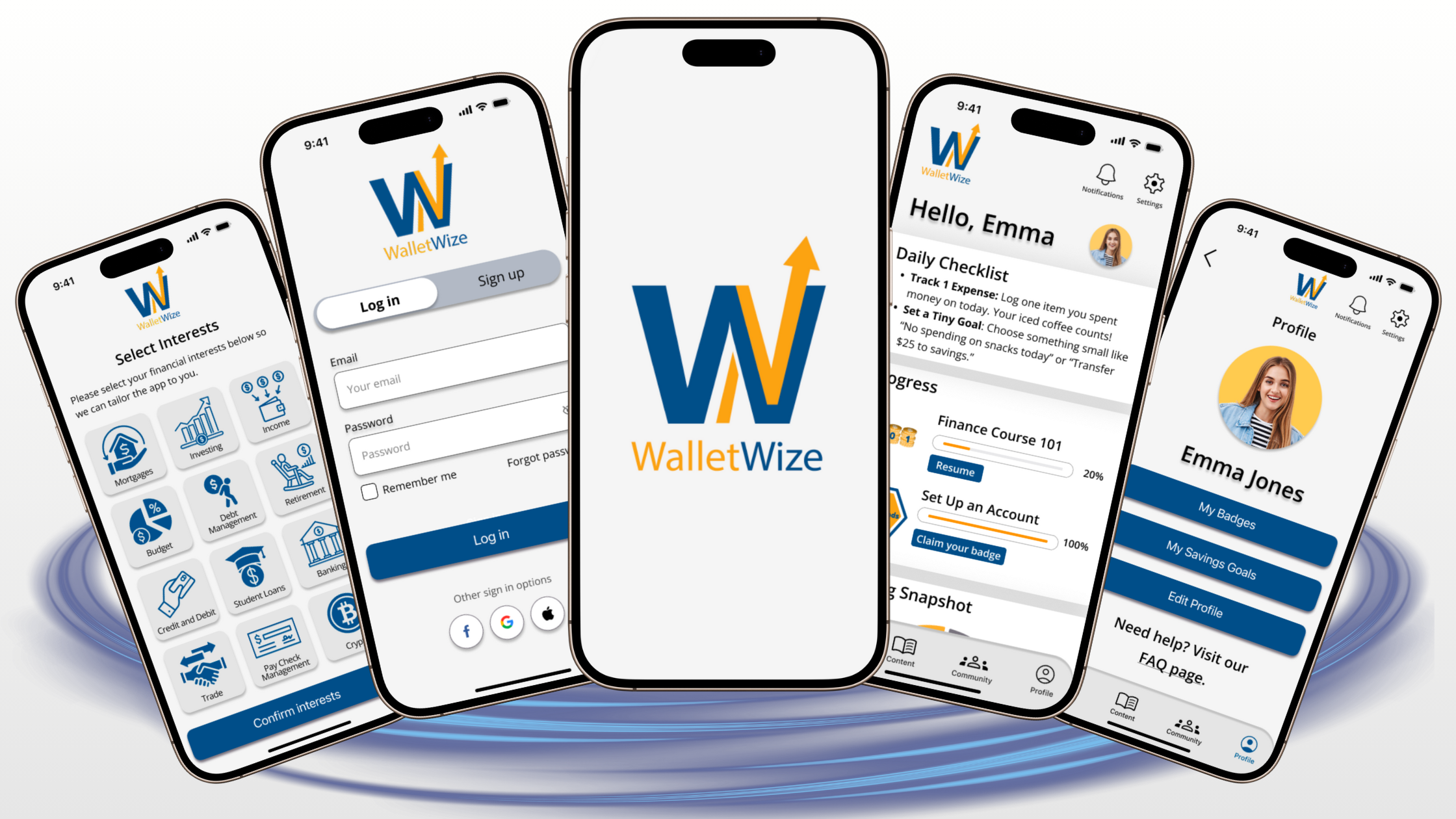
High-Fidelity Mockups
We created high-fidelity mockups that include the colors, typography, content, and all interactive elements. This product serves as a bridge between storyboards and clickable prototypes, providing some clarity on the final look of WalletWize.

Interactive Prototype
Once our high-fidelity mockups were finalized, we connected all buttons, links, and navigation elements with interactive transitions between screens. We wired up all the mockups, creating a fully navigable prototype for the next phase: testing and feedback collection.
Here you can see our Figma prototype:
Trial Run
The final step in this phase involved conducting a trial to ensure that all elements of the prototype were well-designed and functioning properly. We simulated user tasks to identify errors before actual user testing. Additionally, we confirmed that the aesthetic and branding of WalletWize were consistent. Ultimately, we had a prototype ready for testing in the next phase.
Phase 4: Test + Collect

Gathering user feedback
The fourth phase of this design sprint involved gathering direct feedback from real users as they interacted with our prototype. During this phase, we validated assumptions, identified usability issues, and gained valuable insights.
Usability testing
We recruited five Generation Z users to evaluate four prompt tasks. Open-ended questions were used during testing to gather subjective qualitative insights. Additionally, each task was timed to collect objective quantitative data, which helped establish two key performance indicators: Time-on-task and Task success rate. Finally, after the session ended, the users completed a post-test survey, rating several app features.

Prompt tasks:
Task I: As a new user, sign up for an account.
Task II: Complete the budgeting course and emergency fund quiz
Task III: Browse the FAQ page.
Task IV: Browse your friends’ leaderboard.
Questions:
During each task:
- What thoughts or feelings are you experiencing through this task?
- Is there anything else that could help enhance your experience?
Final interview questions:
- How would you describe your overall experience using WalletWize?
- Would you change anything about the app?
- What extra features would you like in this app?
- Is there anything else we can do as developers to enhance this experience?
Results and Outcomes
After completing user testing, we analyzed the data, which revealed the following results:
KPI: Time-on-Task

This figure shows users’ average time (Yellow) to complete tasks, compared to the reference (Blue). Error bars represent users’ standard deviation. This figure does not include users who did not complete the task.
We observe that tasks 2 and 3 had much longer durations compared to the reference, and modifying the prototype may be necessary to improve user experience. Additionally, the standard deviation for task 2 was quite large, which requires further investigation of that specific user path.
KPI: Task success rate

Ideally, all users should complete the assigned tasks. Tasks 2 and 3 had lower than expected
completion rates, and a significant change in the user path is indicated.
Quantitative objective feedback by task
The sign-up task received mainly positive feedback, with approximately 40% of responses being neutral, as some users skipped syncing their bank accounts and activating notifications.


During Task Two, we observed that users had significant difficulties in completing the budgeting course. They indicated that it was not easy to locate this course. Numerous users clicked on various areas of the homepage instead of navigating to the “Content” tab in the footer.
In Task Three, one user quickly found the FAQ page, while other users went through several screens before reaching it. This task mostly received neutral feedback.


In this task, four out of the five users successfully located the Friend/Global leaderboard without any difficulties, accompanied by predominantly positive feedback.
Suggestions from users
“I suggest placing the FAQ feature with a question mark or another element on the homepage for easy access.”
“A short tutorial on the app when you first open it would be beneficial.”
Post-User Testing Survey Results

Learnings and Reflection
Overall, the users gave positive feedback about the app. They were satisfied with their experience and found the app to be intuitive and educational. All users reported confidence in using the app without assistance.
The app’s main strengths were its overall design, including its color scheme, and intuitive screen navigation. The post-test Google survey results show that all users found the app easy to use. Additionally, all users expressed the belief that Gen Z users would learn how to use the app quickly with no expected difficulties.
Areas for improvement:
Difficulties with app-specific tasks
General and nonspecific tasks, such as signing up and managing friends in the app, were straightforward and seamless. WalletWize-specific tasks, such as locating a specific financial course and accessing a question board page, were associated with negative key performance indicators.
- Need to revise the user flow of app-specific tasks
- Add links to the homepage for several app features
- Modify navigation to the courses catalogue page
Heterogeneity of the app users
We observed some variability in the test user sample, as task failure was not specific to individual users.
- Further investigate the heterogeneity of the app users
- Simplify app-specific user flows because of the diversity in Gen Z users’ skills.
Increase long term user engagement
When specifically asked whether they would use this app in the future, all users declined to choose the “very frequently” option and committed to only “occasional use”.
- Data is concerning due to potential user bias aimed at pleasing app developers. More work is needed to attract users and add features that appeal to this group for post-launch engagement.
Overall, the app received very high scores in most areas and was well-received by the Gen Z user group. These usability studies identified some key elements that need modification to ensure a satisfactory user experience.
Conclusion and Next Steps
WalletWize, a digital platform designed to deliver financial education to Gen Z users, was developed through an intensive design sprint. This user-centered design approach, aligned with the Google Design Sprint methodology, has several distinctive features. These include coordinated teamwork, a problem-focused mindset, a strict timeline, and the elimination of endless brainstorming or debates. This method has proved to skip months of discussion and development, resulting in a stronger outcome: a testable solution to validate an idea.
Next steps in the evolution of WalletWize will begin with implementing several app modifications as recommended by the usability studies. Then, will focus on adding features to engage more users in this solution, such as AI-driven live chatbot and short TED-like financial tutorials. Also, efforts would be made to develop a comprehensive business plan with an emphasis on collaborations with other organizations and institutions.
Overall, WalletWize is a vital educational tool for a generation lacking financial skills, and I truly believe this platform would be highly valuable and rewarding.
Below is the complete Sprint Report we created from this process.