When we use a website, we rarely consider the design choices behind each button, label, and filter. We simply expect things to work as we assume they will, but sometimes they don’t, and frustration quickly takes over curiosity. A key part of the development process that can prevent this is usability testing.
In this blog, I’ll explain what usability testing entails and share insights from my recent experience conducting usability testing on VisitMexico.com, the official tourism digital gateway for Mexico.
What is usability testing?
According to the Interaction Design Foundation, usability testing involves assessing how easy a design is to use by observing a group of representative users. It generally involves observing them as they try to complete specific tasks and can be applied to various design types. This process is often repeated from the early development stages through the product launch.
By conducting usability tests, we can uncover design flaws that might otherwise go unnoticed. Monitoring users’ behavior during task completion provides valuable insights into the functionality of our design or product. These insights help us make precise improvements to enhance usability.
The main objectives of usability testing are:
- Determine whether testers can complete tasks successfully and independently.
- Assess their performance and mental state as they try to complete tasks.
- Observe how much users enjoy the product
- Identify problems and assess their severity
- Search for potential solutions
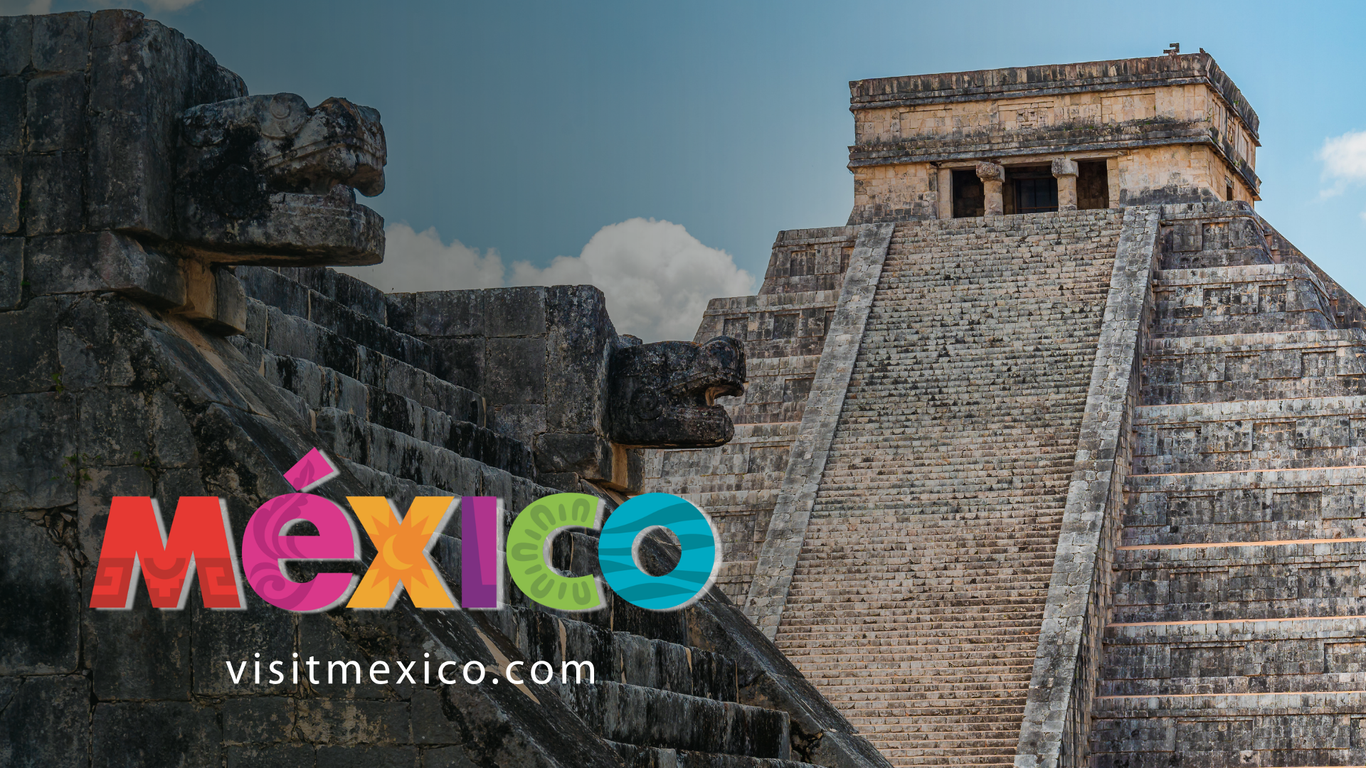
My user testing experience – VisitingMexico.com
VisitMexico.com is the official online tourism portal dedicated to promoting travel to Mexico. It aims to inspire and assist both international and domestic travelers in planning their trips. Potential visitors can explore main destinations, monthly available experiences, cultural attractions, itineraries, and key information relevant to international tourists. For this website, I have conducted a usability test following these steps:
Step 1: Define the research goals and questions
Defining the research goals and questions before starting our usability study is essential because they guide the research’s direction, structure, and importance.
VisitMexico.com‘s main goals were to find usability barriers, assess the clarity of the information architecture, and understand how well the site helps users plan trips to Mexico.
The research questions this study tried to answer were:
- Can users efficiently locate key travel information, such as destinations, itineraries, and activities?
- Do users find the navigation and search functionality intuitive and helpful?
- Are there specific points of confusion, frustration, or unmet expectations during typical travel planning tasks?
Step 2: Define the methodology
Here, I outlined my plan to carry out user testing research. I chose to perform my user testing in a moderated, remote setting. The participants completed the testing from their homes using their computers and were recorded for analysis of the results, with their prior consent.
Step 3: The participants
I recruited potential website users with travel experience and diverse backgrounds. Two were English speakers, and one was a native Spanish speaker. Two had visited Mexico before, while one had not. This diversity aimed to gather accurate data during the usability testing session.


Study participants, Photo taken by the author.
Participant 2, Usability Testing VisitMexico.com. Video by the author.
Step 4: The script and user tasks
The script included a monologue where I introduced myself and explained all the steps for the users. I emphasized that during user testing, we were evaluating the website, not their skills. In this script, I made sure to get their approval for the recording. I mentioned that each user must complete a questionnaire to assess all my findings – some examples:
- Do you have any suggestions or feedback about this task?
- How easy was it to complete this task on a scale from one to five?
I outlined specific user tasks to assess different aspects of the website, such as navigation, interaction, content readability, and specific user paths. All of this was to identify areas for improvement. The established tasks were:
Task 1:
You’re gathering inspiration for a potential trip to Mexico. Make a list of three places you’d like to visit, considering your interests, such as culture, cuisine, nature, or adventure.
Task 2:
As a first-time visitor to Mexico, you would like to learn more about visas, current exchange rates, and transportation options. Please find these three options.
Task 3:
Let’s assume you’re planning a family trip to a beach destination in Mexico. Choose a 7-day itinerary that meets all your needs.
Task 4:
Imagine you are traveling to Mexico in a specific month (e.g., Next month). Find out if there are any festivals, events, or seasonal recommendations happening during that time.
Task 5:
You are currently gathering information for a trip to Mexico. You are especially interested in visiting archaeological sites. Make a list of three places you’d like to visit.
Step 5: Defining the metrics
The usability study findings included both objective key performance indicators (KPIs) and subjective data. The KPI I used in the user testing were: Time to complete the task, Percent of completed tasks, and Usability Scale (SUS). Along with those objective measures, I gathered subjective data for each task, including my impression of the user during the process. I assessed his words, facial expressions, tone, and overall experience. I also tracked their task pathway and documented how they navigated through the website.
Step 6: Study results
Not all three users completed all three tasks, as shown in this graphic. Tasks #2 and #5 highlighted usability issues that prevented users from reaching the goal. In my presentation shown below, we can observe each task analysis in detail.

This graphic shows a significant difference in time completion between Spanish-speaking users (P2) and non-Spanish speakers (P1 and P3). It highlights the challenges and gaps in the English sections and pages of the website.
Task 5 was the most complicated to complete, and only one user, the Spanish-speaking one (P2), appeared to have completed it. This task caused some frustration among participants.

Step 6: What usability insights have been identified?
- The main insight was the language gap, with key sections like itineraries, event listings, and the Tourist Atlas in Spanish-only, affecting trust, accessibility, and success. The Spanish speaker completed tasks more confidently, revealing a clear user experience disparity.
- Navigation clarity was another critical takeaway. Labels such as “Plan your next adventure” and “Unmissable this month” did not align with users’ mental models. Participants often clicked based on guesswork rather than certainty. This signals an information architecture issue—not a user problem.
- Certain navigation features, such as filtering and search, have accessibility issues and do not provide users with accurate information.
- Task 5 (archaeological sites) revealed a major usability failure: a high-interest travel category became hard to access, leading to frustration and abandonment. Difficulties in finding cultural attractions threaten the platform’s purpose.
Conclusion
Testing VisitMexico.com revealed significant issues with language accessibility, navigation clarity, and information structure that directly impact task success and user confidence. While the platform offers rich, inspiring travel content, its value diminishes when users cannot access it easily or consistently across different languages.
Usability testing provided valuable insights based on actual user behavior. By addressing identified friction points—especially language consistency, clearer navigational labels, and easier access to popular content—the experience can better align with users’ mental models and expectations. Designing for clarity, accessibility, and inclusivity is more than just improving usability; it is essential to building trust and delivering a seamless travel-planning experience.
If you want to read more, here is the full presentation of VisitMexico.com usability testing.