If there is one thing you should know about Costa Rica, it is that it is a tourist paradise. As a native Costa Rican, or “Tico” as we call ourselves, I can attest firsthand how important tourism is to the country. When I lived there and asked tourists how they decided to visit, many of them came up with the idea, planned their trips, and used ChatGPT to help craft their itineraries – all from the internet. When it comes to tourism, a strong online presence is the main gateway, the primary hook. This digital doorway to the country needs to be attractive, user-friendly, and provide visitors with a taste of the culture that leaves them hungry for more.
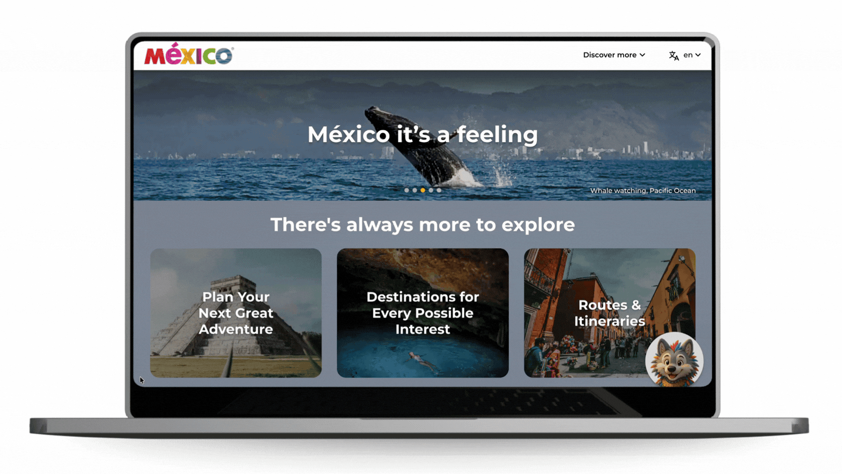
VisitMexico.com
Mexico, our not-so-far neighbor, also has an official tourism website. The Secretary of Tourism (SECTUR) manages it – VisitMexico.com. This is the official travel site that promotes tourism in Mexico. It offers visitors information on destinations, cultural sites, events, and travel planning tools. The website aims to inspire both international and domestic travelers and strengthen Mexico’s tourism industry. While Mexico is stunning and beautiful, this website doesn’t quite meet its standards.
The current website has multiple usability and accessibility issues that limit its effectiveness as a travel planning tool. The navigation is confusing and disorganized, making it difficult for users to understand how to explore destinations or plan their trips. Important information is often hidden within dense text or scattered across external links, such as PDFs and third-party websites. Additionally, language accessibility is inconsistent, with some content remaining untranslated even when users select the site’s English version.
Methodology
User experience research was conducted on VisitMexico.com to identify potential solutions. Various methods were employed to gather user feedback, and the collected data was thoroughly analyzed. This process resulted in recommendations to improve specific aspects of the website. The methods used in this study included:
Personas

Competitive Analysis

User Interview

User Survey

Diary Studies

Card Sorting

Heuristic Evaluation

Usability Testing

This blog explores several of these methods, sharing the results and analysis. Some are still proposals that haven’t been tested with real participants. For full details on these methods, please refer to the attached document below.

Personas
To gain a clearer understanding of user motivations and behaviors, the research developed personas representing various traveler types, such as cultural explorers, business travelers, and retirees planning family trips. These personas revealed common needs, including reliable information, curated recommendations, and easily scannable travel details.


Competitive Analysis
A comparative analysis of regional tourism websites, such as Visit Costa Rica, Visit Brazil, and Argentina Travel, identified industry best practices. Competitors generally offer clearer information, more languages, and better visuals. They also feature helpful tools like bookmarking, newsletters, chatbots, and itinerary planning.
VisitMexico.com provides rich cultural content and an interactive atlas, but its complex navigation, limited language options, and heavy text make it less usable and less competitive.


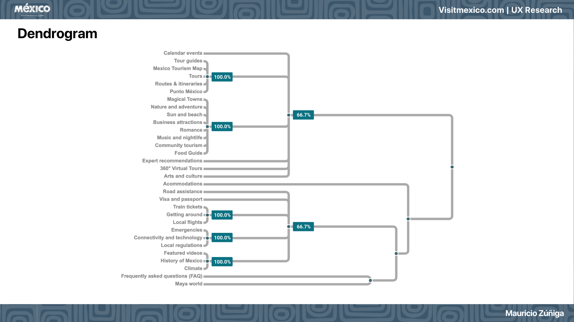
Card Sorting
Card sorting is a common method for studying user experience, in which participants sort physical or digital cards with content, features, or ideas into meaningful groups. It helps improve information organization and navigation by revealing user expectations and mental models.
Visit Mexico Card sorting revealed that users prefer navigation organized around travel goals rather than static informational categories. Participants grouped content into intuitive themes, such as destinations, activities, trip-planning resources, travel logistics, and local information. This indicates that the website’s current structure does not fully align with users’ mental models.
For this study, a quantitative tool called “Dendrogram ” displays clusters of participants’ cards with similar qualitative results. By grouping participants by shared qualitative codes, we make our findings easier to understand. This tool helps to understand a potential Information architecture for the website.

Usability Testing
Usability testing assessed how well users could perform typical travel-planning tasks. The following tasks were evaluated:
Task 1:
You’re gathering inspiration for a potential trip to Mexico. Make a list of three places you’d like to visit, considering your interests, such as culture, cuisine, nature, or adventure.
Task 2:
As a first-time visitor to Mexico, you would like to learn more about visas, current exchange rates, and transportation options. Please find these three options.
Task 3
Let’s assume you’re planning a family trip to a beach destination in Mexico. Choose a 7-day itinerary that meets all your needs.
Task 4:
Imagine you are traveling to Mexico in a specific month (e.g., Next month). Find out if there are any festivals, events, or seasonal recommendations happening during that time.
Task 5:
You are currently gathering information for a trip to Mexico. You are especially interested in visiting archaeological sites. Make a list of three places you’d like to visit.
During this research study, participants from diverse backgrounds, including English- and Spanish-speaking individuals, were recruited across a range of ages and education levels. This approach aimed to collect more precise and accurate data. The tests revealed several friction points, particularly in navigation and information discovery. Participants struggled to quickly locate specific information, especially when seeking events, travel logistics, or curated travel recommendations. The results also showed that lengthy text sections and unclear navigation pathways significantly slowed task completion.

Not all three users completed all five tasks, as shown in this graphic. Tasks #2 and #5 highlighted usability issues that prevented users from reaching the goal. In my presentation shown below, we can observe each task analysis in detail.
An interesting insight from the data was that participant two (a native Spanish speaker) scored the highest on average for usability across all tasks. Because the website was primarily in Spanish, she felt more confident during the usability study than the other two participants, who only spoke English.

Final recommendations
Based on the combined findings from all research methods, several key recommendations emerged to improve the user experience.
1. Simplify and restructure the information architecture
The current navigation is fragmented, grouping content by topics rather than by traveler goals. Reorganizing into clear, task-focused sections—like “Where to go”, “Plan Your Trip”, and “Things to Do”—would make it easier for users to find information. Simplifying navigation and removing broken or redundant links would also boost credibility and trust.
2. Improve global accessibility through expanded language support
VisitMexico.com, as an official tourism platform for international visitors, should support more languages beyond English and Spanish. Fully translating all content would enhance accessibility globally, reduce user confusion, and prevent visitors from abandoning the site. Also, there is untranslated content in the English section that should be addressed, as suggested by the usability studies.
3. Enhance content clarity, scannability, and visual hierarchy
Some of the current content relies on dense text or external documents, disrupting user experience and causing friction. Summarizing long content into bullet points, visual guides, and adding visuals and interactive elements would enhance readability and engagement. Additionally, improving event discoverability with clearer terminology and better calendar options is also essential.
4. Introduce user-centered planning tools
Features such as saved destinations, favorites, bookmarks, and personalized suggestions can help travelers plan trips, save attractions, organize activities, and encourage repeat visits. Also, adding guided exploration, such as smart filters, can improve discoverability and personalization.
5. Maintain transparency and build trust through a consistent user experience
As a government-run tourism portal, VisitMexico.com must be reliable and credible. Providing consistent quality, clearly marking external links, and offering balanced travel and safety info can build user trust and help them make informed choices.
Conclusion
The UX research for VisitMexico.com highlights key opportunities to enhance the site as a travel-planning resource. Using methods such as personas, competitive analysis, card sorting, and usability testing, clear patterns emerged regarding user challenges. While the site offers rich cultural content, its information architecture, inconsistent language options, and dense content create friction, limit usability, and engagement.
Aligning the site more with users’ mental models and travel habits is crucial. Simplifying navigation, improving content scannability, expanding language accessibility, and adding practical travel tools may improve the user experience. Reducing reliance on external sources and consolidating key travel info within the platform could also make VisitMexico.com more comprehensive and trustworthy.
This study highlights the importance of user-centered design. Implementing these suggestions may help VisitMexico.com to better inspire travelers, assist trip planning, and strengthen Mexico’s online tourism presence.
If you want to read more, here is the full presentation of VisitMexico.com UX research Analysis